Jerry’s Art Supply & Framing Wholesale Club
This eCommerce site redesign was a concept project I worked on during my time in General Assembly’s UX Design Immersive.

Timeline:
2 weeks
Tools:
Pen + paper
Sketch
InVision
Scope:
Mid-fidelity prototype for responsive screens
Mid-fidelity mobile wireframes of a home page, a product page, and a shopping cart page
The discovery process commences…
Upon performing a heuristics evaluation and C + C analysis, it became clear that Jerry’s site was lacking many of the standard elements and features of a typical eCommerce site, including:
Search bar
Product recommendations
Way to write or read reviews
Consistent product description pages

Jerry’s current homepage
The research continues…
I began looking into what current customers of Jerry’s might find useful in an online store. Based on Google reviews, the main draw of Jerry’s seemed to be the potential for savings via deals and membership. However, the site’s FAQ section stated that promos and coupons weren’t being accepted for online purchases at the time. (For context, this was in the midst of the 2020 Covid-19 pandemic.) With sales shifting from in-person to online over the previous months, not accepting promos for online purchases seemed detrimental to Jerry’s business.
Armed with this information, I developed a proto-persona:

Gail Armstrong
Age: 65
Occupation: Retired art teacher
Appreciates: Saving money when possible
Does not appreciate: Being scolded by her grown children
I created a journey map for Gail. I imagined Gail realizing she was running low on pastels. She had a coupon for Jerry’s, but knew that her kids would scold her if she went to shop in-person during the pandemic (being 65, she was at higher risk of becoming infected). So she logged into her account on the website and navigated to the pastels. After adding them to her cart and proceeding to checkout, she looked for a place to type in her coupon code but was disappointed to realize there actually wasn’t one. She ultimately decided to abandon her cart, because she began to feel guilty about paying full price for art supplies during a pandemic.

Collecting and synthesizing the data…

After mapping out Gail’s journey, I hypothesized that affordability would be the biggest pain point I’d come across during user interviews. However, affinity mapping the data illuminated users’ main concern: feeling confident in their purchases. Due to this concern, most users favored shopping in-person for art supplies over online, in large part because of the tangibility of the products and access to knowledgable employees.
Primary User Persona

Goals:
To support her local economy
To stay healthy during the pandemic
To order the appropriate supplies for her art class
Pain Points:
Finds it difficult to get inspired when shopping online
Isn’t often confident with her purchases when shopping online
Has a pre-existing health condition that prevents her from shopping in-person during the pandemic
Amy Johnson | Executive Assistant | Age 37 | Single
Amy takes lots of art classes but considers herself a hobbyist. She loves walking around art stores and being able to browse leisurely while looking at supplies up-close and trying out different tools. She frequently leans on the expertise of employees to help inform her choices. It’s important to her during this time that she supports local businesses like Jerry’s, but she has a pre-existing health condition that has been preventing her from shopping in-person.
Arriving at the problem statement…
Amy needs a way to buy art supplies online that allows her to support her local store while feeling confident in the products she chooses.
Beginning the design process…
How might I instill the feeling of confidence Amy has shopping in person when she shops online?
Things I kept in mind while brainstorming solutions for Amy*:
reviews
multiple images of a product
descriptive product information
professional advice and recommendations (AKA the store’s employees)
*Informed by data from user interviews
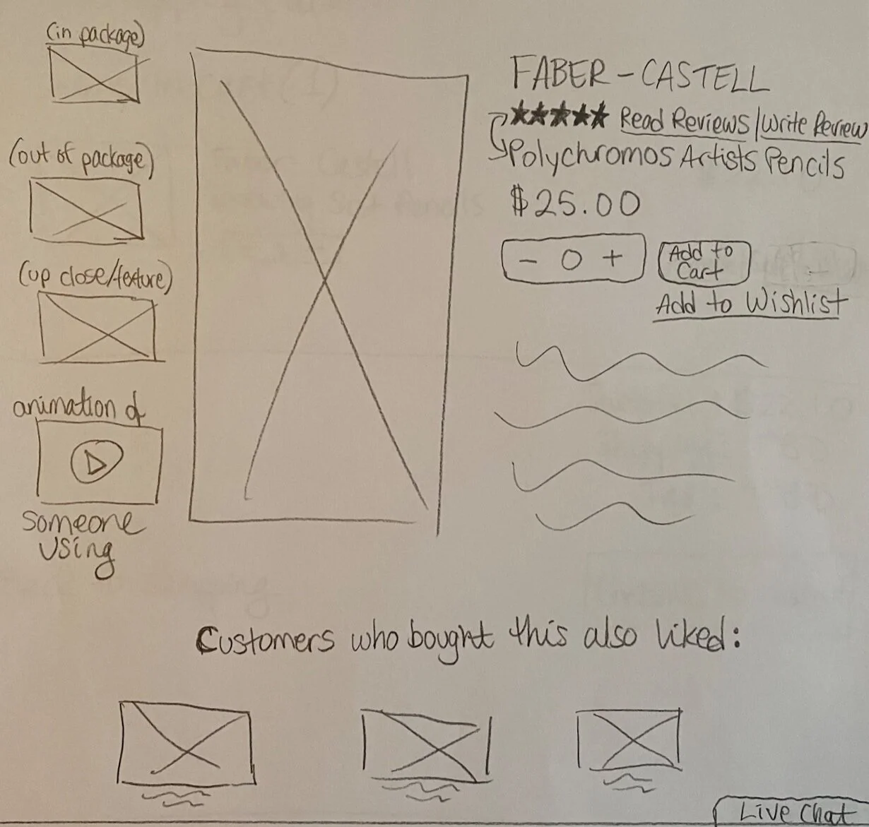
Hand sketch of a product description page

Initial digital wireframe of a product description page

I landed on a user flow of what I envisioned Jerry’s newly re-designed site to look and act like, then got to work usability testing the desktop prototype!
Usability Testing
Goal:
Users will be able to confidently make a purchase in under 2 minutes.
Logistics:
Conducted via video call
Unmoderated
Number of Participants:
5
User Scenario:
This is an eCommerce website for an art supply store. You want to place an order for pencils, and feel confident that you got the best quality pencils possible.
Task:
Click through the prototype and walk me through the steps you’d take to order the best quality pencils possible.
Metrics:
Quantitative: Users will be able to complete the task in under 2 minutes.
Qualitative: Users will feel confident that they got the best quality pencils possible.
Iterations
Usability testers seemed perplexed by the over-complicated navigation labels, so in my first iteration I simplified them:

Original Navigation

Iterated Navigation
The stars I initially used to indicate product ratings were also confusing to users during testing, so these changed as well:

Original Rating Stars

Iterated Rating Stars
Takeaways + Next Steps
Key Takeaways:
When it comes to design, simplify, simplify, simplify! (See: navigation iteration)
Use visual elements that users are already familiar with. (See: rating stars iteration)
Research Insights:
I was initially expecting affordability to be users’ main concern, but was surprised to learn that confidence was the real issue that needed to be addressed during this project.
After confidence, inspiration was the recurring theme throughout user interviews. Users get a lot of inspirational value from leisurely browsing, particularly in-store.
Challenges:
Determining then finding the right type of users can be challenging. A way to alleviate the stress of this challenge was to mentally categorize users by “ideal” (online art supply shopper), “second-tier” (in-store art supply shopper), and “sufficient” (someone who shops online or in-store).
Favorite Step in the Design Process:
Digital wireframing! Nothing like putting on some music and getting into that flow state.
Potential Next Steps:
Page of case studies for users to take inspiration from
Featured projects section highlighting local artists using tools and supplies sold at Jerry’s